The colors that surround us in our homes do far more than simply complement our furniture—they directly influence our emotional state and energy levels throughout the day. Color psychology in interior design explores this powerful relationship between specific hues and our psychological responses. Understanding how colors affect mood in the home can transform ordinary spaces into environments that actively support our wellbeing. This article explores the emotional impacts of different colors and provides guidance on choosing paint colors by room function to create spaces that feel as good as they look.
The Science Behind Color Psychology
Color psychology isn’t simply interior design folklore—it’s backed by scientific research. Studies have shown that different wavelengths of light (which we perceive as colors) can trigger hormonal responses that affect our mood, heart rate, and even productivity. When selecting colors for your home, you’re essentially programming an emotional experience for yourself and your family. The relationship between color and emotion is both universal and deeply personal. While certain responses to colors are widely shared across cultures, individual experiences and associations also play a significant role in how we react to specific hues.
Understanding color psychology in interior design allows homeowners to create intentional environments that support their lifestyle goals. For instance, a home office might benefit from colors that enhance focus, while a bedroom requires hues that promote relaxation. The strategic use of color throughout your home can create a cohesive emotional journey as you move from room to room.
Red, Orange, and Yellow: The Energizers
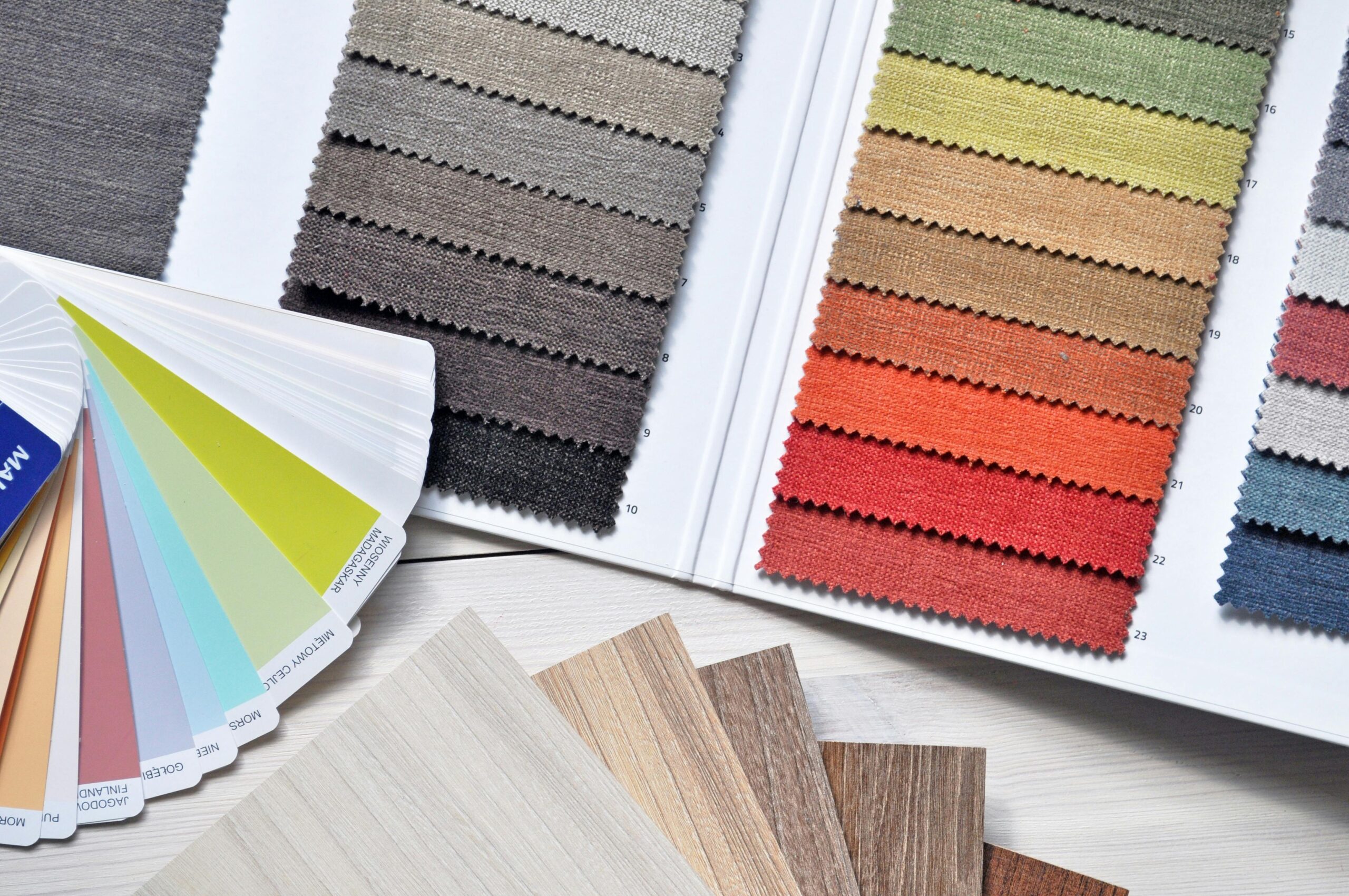
Warm colors like red, orange, and yellow are known for their energizing properties. Red stimulates conversation and excitement, making it ideal for dining rooms where you want to encourage lively interaction. However, using red as a dominant color requires careful consideration, as it can also increase heart rate and blood pressure—making it less suitable for spaces dedicated to relaxation.
Orange combines the energy of red with the cheerfulness of yellow, creating a welcoming and enthusiastic atmosphere. This color works beautifully in exercise rooms or play areas where high energy is desirable. Yellow, often associated with sunshine and optimism, is perfect for creating energizing kitchen colors that stimulate conversation and promote a positive outlook during morning routines. A buttery yellow kitchen can transform breakfast time into a mood-boosting experience that sets a positive tone for the day.
Blue, Green, and Purple: The Restorers
On the cooler end of the spectrum, blue, green, and purple offer restorative qualities. Blue reduces blood pressure and heart rate, explaining why calming bedroom colors often feature this tranquil hue. From pale sky blue to deeper navy, these tones create a sanctuary-like atmosphere conducive to quality sleep and relaxation.
Green bridges the gap between warm and cool colors, offering balance and harmony. Associated with nature, green reduces stress and promotes a sense of renewal, making it versatile enough for any room in the home. Purple, with its associations of luxury and creativity, works well in spaces dedicated to artistic pursuits or meditation. Lighter lavenders promote tranquility while deeper purples add a sense of intrigue and sophistication.
Neutrals: The Foundation of Color Schemes
Neutrals like white, beige, gray, and black serve as the foundation for most interior color schemes. White creates a sense of spaciousness and cleanliness but can feel cold without warming elements. Beige offers warmth and versatility, while gray provides sophisticated neutrality that complements both warm and cool accent colors. Black, when used judiciously, adds drama and definition to a space.
When choosing paint colors by room function, these neutrals can serve as a backdrop that allows accent colors to create the desired emotional effect without overwhelming the space. For example, a primarily neutral bedroom with strategic blue accents can deliver calming bedroom colors without creating a cold or monotonous environment.
Color Application Strategies for Different Rooms
The strategic application of color psychology in interior design varies by room purpose. Bedrooms benefit from calming bedroom colors like soft blues, lavenders, and gentle greens that promote relaxation and quality sleep. These colors lower blood pressure and create a sanctuary-like atmosphere essential for rest.
Kitchens thrive with energizing kitchen colors such as yellows, light oranges, or bright greens that stimulate conversation and appetite. These colors create a welcoming environment for both family meals and entertaining. Living rooms, as multi-purpose spaces, often work best with versatile colors like greens or warm neutrals that can adapt to different activities and times of day.
Home offices require colors that promote focus and productivity without causing eye strain or overstimulation. Soft greens, blues, or calming neutrals with energizing accents often create the ideal balance. For personalized color palette recommendations based on your specific space and lifestyle needs, AskHomey offers custom color consultations that take into account both color psychology principles and your personal preferences.
Bringing It All Together: Creating Color Harmony
Creating harmony when applying color psychology in interior design requires consideration of the entire home as a cohesive unit. Transitions between rooms should feel natural rather than jarring. Consider how adjacent spaces flow into one another and how colors in connecting rooms will interact. The impact of natural and artificial lighting on your chosen colors cannot be overstated—test samples under different lighting conditions before committing to a full room.
Remember that color is just one element of interior design. Texture, pattern, and material choices all influence how a color is perceived within a space. A blue room can feel dramatically different depending on whether the blue appears on glossy paint, matte walls, or textured wallpaper. The psychological impact of color works in concert with these other design elements to create the overall feeling of a room.
For more tips and to connect with reliable home service professionals, follow AskHomey on Facebook and Instagram.