Selecting the right paint color for your home can transform a space from ordinary to extraordinary, but the process often feels overwhelming with countless options available. The perfect paint color can enhance architectural features, create a specific mood, and complement your existing furnishings. In this comprehensive interior paint color guide, we’ll explore the key factors to consider when making this important decision, from assessing natural light to evaluating room size and function. By the end of this article, you’ll have the confidence to select wall colors that truly reflect your style and meet your home’s unique needs.
Understanding How Light Affects Paint Colors
Perhaps the most influential factor when you choose paint color tips to follow is considering how light interacts with pigment. Natural light varies dramatically depending on the direction your windows face: north-facing rooms receive cooler, more diffused light that can make colors appear more muted, while south-facing rooms are bathed in warm, direct sunlight that brightens and intensifies colors. East-facing rooms receive bright morning light that appears somewhat yellow, and west-facing spaces get warm afternoon light with reddish tones. Additionally, artificial lighting plays a crucial role – incandescent bulbs cast a warm glow that enhances reds and yellows, while fluorescent lighting tends to bring out blues and greens.
To properly evaluate any potential paint color, observe paint samples at different times of day and under various lighting conditions in the specific room you’re painting. What looks perfect in the store might appear entirely different in your home’s unique lighting environment. This critical step in your interior paint color guide process helps avoid costly mistakes and disappointment after the painting is complete.
How Room Size and Proportion Influence Color Selection
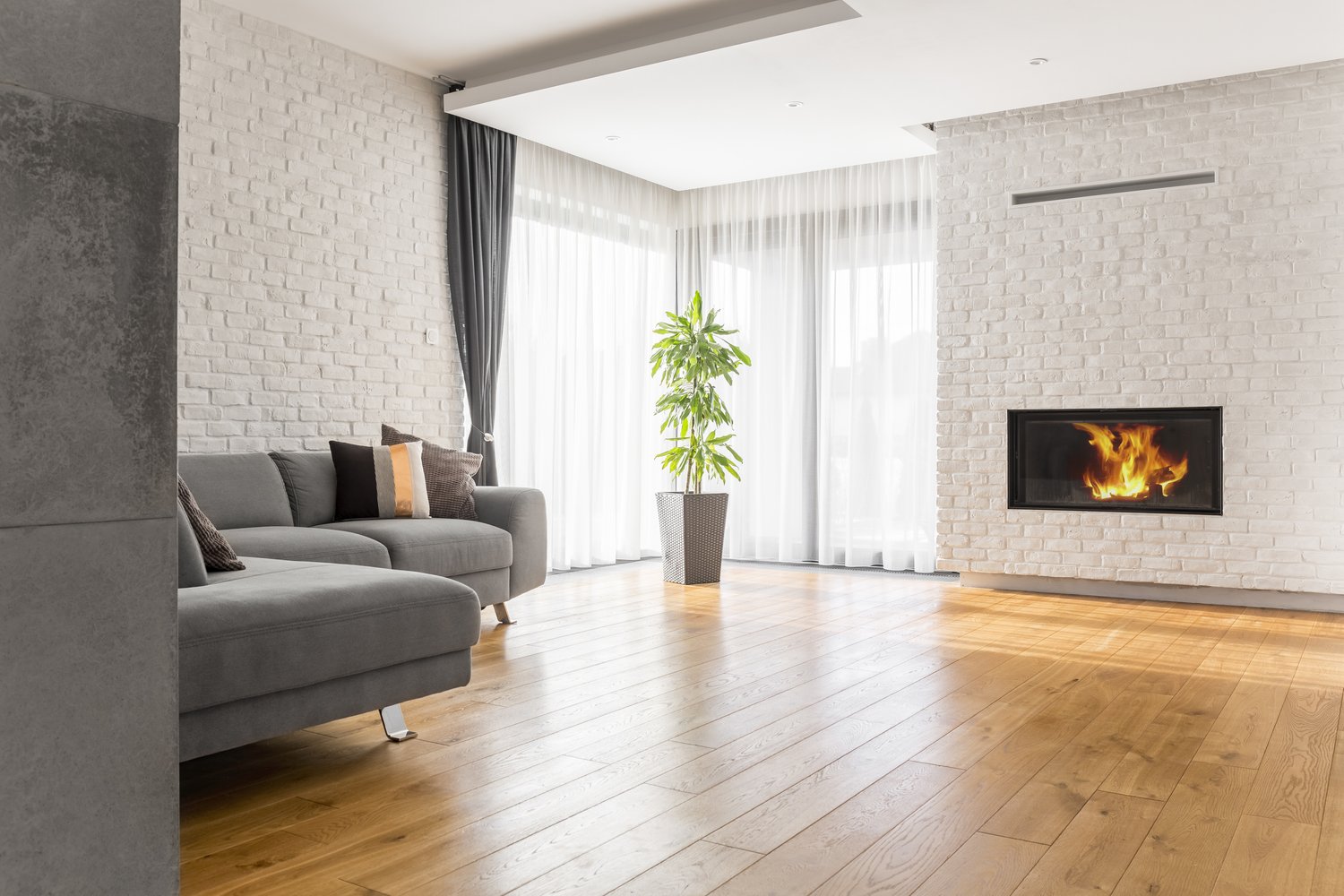
When learning to select wall color appropriately, understanding how color affects spatial perception is essential. Dark colors tend to make walls visually recede, potentially making a small room feel more intimate but also potentially smaller. Light colors generally make spaces feel more expansive and airy, which is why they’re often recommended for smaller rooms or areas with limited natural light.
However, these aren’t absolute rules. A small room painted in a dark, rich color can feel like a cozy, sophisticated jewel box rather than cramped. Similarly, tall rooms with high ceilings might benefit from darker colors to create visual balance and make the space feel more proportionate. The key is considering how you want the room to feel functionally and emotionally, not just following prescriptive advice about what colors “should” be used in certain spaces.
Selecting Colors That Create the Right Mood
Colors profoundly affect our emotions and behaviors, making mood one of the most important considerations when reviewing best paint colors living room options or for any space in your home. Cool colors like blues, greens, and purples tend to create calm, relaxing environments ideal for bedrooms and bathrooms. Warm colors such as reds, oranges, and yellows can energize a space, potentially making them excellent choices for dining rooms, kitchens, or exercise areas.
Neutrals offer tremendous versatility and staying power. Beiges, grays, and whites create sophisticated backdrops that allow architectural details and furnishings to shine. Modern “greige” options—blends of gray and beige—have become particularly popular for their chameleon-like ability to adapt to different lighting conditions and complement various design styles. As mentioned by color experts at AskHomey, the intensity of a color also matters significantly; saturated colors create drama and interest, while muted tones tend to feel more relaxing and timeless.
Coordinating with Existing Elements
One of the most practical choose paint color tips involves working with what you already have. Permanent features like flooring, countertops, cabinetry, stonework, and architectural details should guide your color selection since these elements are typically more expensive and difficult to change than wall paint. If you have warm-toned hardwood floors or cabinetry, colors with warm undertones will generally coordinate more harmoniously.
Similarly, your existing furniture, artwork, and textiles should inform your color choices. If you’ve invested in specific furniture pieces or decorative items you love, select wall colors that enhance these elements rather than compete with them. For those seeking the best paint colors living room environments, consider pulling subtle tones from your largest upholstered pieces or area rugs to create a cohesive look. This approach ensures that your painted walls support and enhance your overall design rather than creating visual discord.
Testing Before Committing
The final and perhaps most crucial step in any interior paint color guide is proper testing. Paint large sample boards (at least 2 feet square) with your potential colors and move them around the room at different times of day. Observe how they look next to trim, flooring, furniture, and in various lighting conditions. This approach is far more effective than small paint chips or even painted patches directly on walls, as it allows you to see how the color behaves in your space without committing to painting an entire wall.
Many professional designers follow the “three sample rule,” narrowing options to three choices before making a final decision. This methodical approach helps prevent decision fatigue and allows for thoughtful comparison between closely related shades. Take your time with this process—rushing a paint color decision often leads to disappointment and potentially expensive do-overs.
For more tips and to connect with reliable home service professionals, follow AskHomey on Facebook and Instagram.